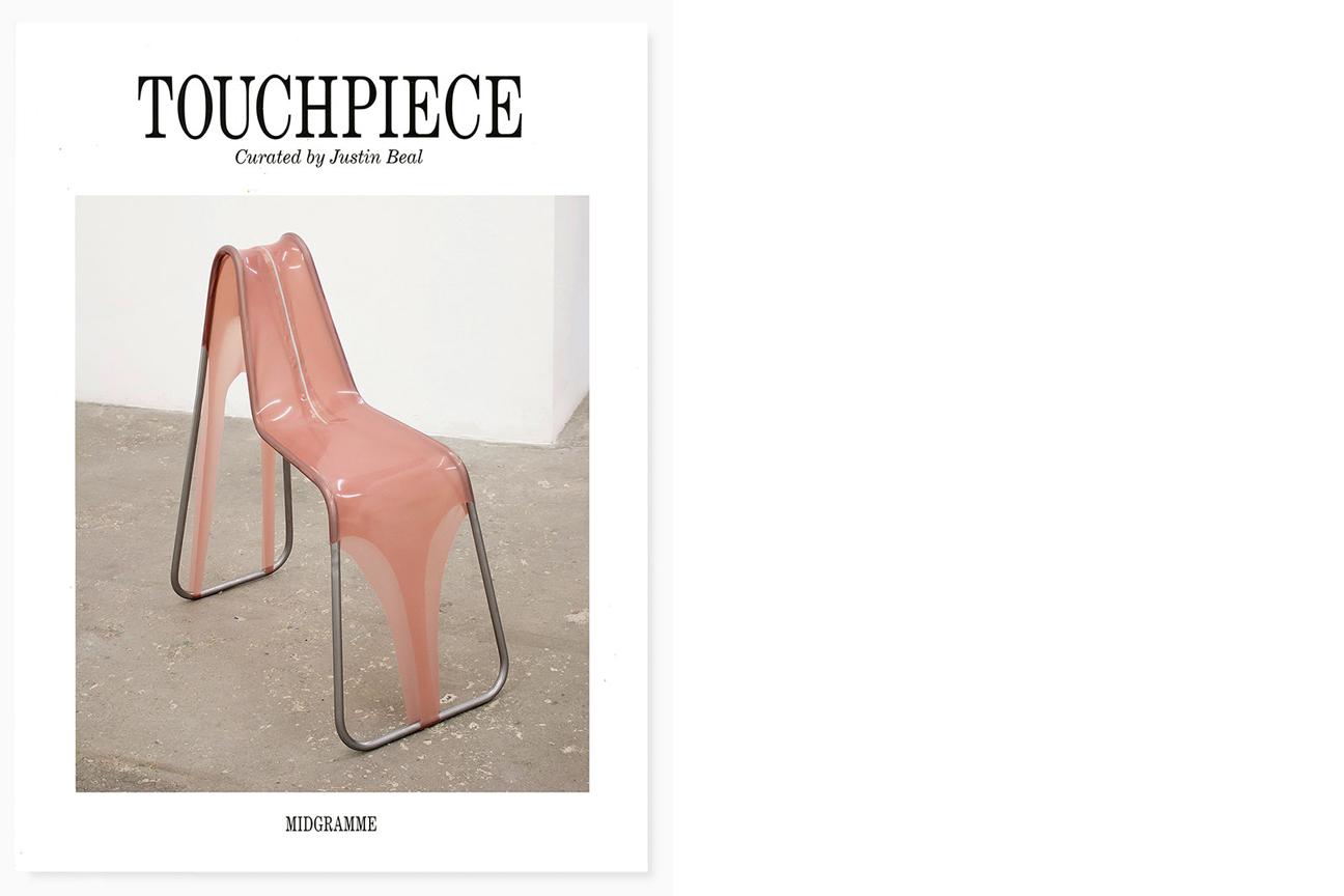
TOUCHPIECE
Midgramme 2018
design by Mark Owens with Nilas Andersen
Here’s to the balls that rest over the seat, Under the layers of fabric and pants with a pleat, Or ragged old jeans riding low on the ass, Teasing what’s under like Walt Whitman’s grass. Tom Burr Anxiety (or An Ode to the Chair, or Lullaby to a Stranger or These Many Mirrored Moods of Mine) 2006
This exhibition takes its title, Touchpiece, from a series of sculptures made by Phyllida Barlow between 1983 and 1989. The sculptures—rough assemblages of upholstery foam, particleboard, cardboard and laminate—resemble the bundled remnants of an exploded piece of cheap furniture. Barlow’s title is a compound form of the term “touch piece,” a coin believed to cure disease and influence behavior. A touch piece, unlike the more general category of amulet or talisman, depends on human contact for its desired power to be obtained or transferred. The object is activated only by its interaction with a body. Much of the work in the show directly addresses the way bodies interact with the built environment—how they push and pull against architecture and, in turn, how architecture exerts pressure on the bodies within it. To borrow a phrase director Peter Greenaway used to describe his 1987 film, The Belly of an Architect, a central concern of this project is “the relationship of the soft body to the hard core.”
The first piece selected for the show was an Andrea Branzi bench borrowed from furniture dealer Joel Chen’s expansive collection, which happens to be housed just two doors south of Hannah Hoffman on Highland Avenue in Los Angeles. The bench—a matte gray base with raw birch stiles and top rails—is from a series of objects that Branzi and his wife Nicoletta produced in the late 1980s in conjunction with a book entitled, Domestic Animals: The Neoprimitive Style. The Branzis describe their furniture and clothing as hybrid “creature-objects” that can be both utilitarian and contemplative, functional and formal.
Andrea Branzi was at the center of the radical architecture movement in Italy that embraced an “anti-design” position in reaction to both the prescriptive logic of functionalism and the commercial emphasis of the Milan design industry. This strategy was the focal point of a group of artists, designers and architectural collectives that came together between 1973 and 1975 in a series of open workshops called Global Tools. The group described the workshops as a “system of laboratories for the propagation of the use of natural materials and techniques and associated behaviors.” Global Tools included industry luminaries like Branzi, Ettore Sottsass and Alessandro Mendini, but its core sensibility was more in line with their less commercial contemporary Ricardo Dalisi, known for a heuristic, “back to zero” approach to design education that was more concerned with communication than production. The workshops were divided into five subsets: theory, construction, survival, communication and the body, the latter of which focused on the body as a “primary instrument” and produced the workshop’s most compelling experiments (including Mendini’s Leg Constraints and Franco Raggi’s Blindflold Mask to Display an Ear).
Remo and Elena Buti designed a graphic identity based on the motif of an empty pegboard that became both a logo and a ground for the iconic recto/verso covers of the short-lived publication, Global Tools Bulletin (only two issues were ever printed). There is a connection, both in form and sensibility, between Buti’s template and Shannon Ebner’s Strike Alphabet, a font family comprised of photographs of cinderblocks hung on a system of steel pegs in the artist’s studio—a literal concrete poetry. Ebner’s Blank Field depicts the empty grid used to construct the Strike Alphabet. It is a tabula rasa (in the original sense of the word) for the physical construction of language, which, unlike conventional typography, requires the manual act of lifting cinderblocks into place to compose each letter and, as such, implies both an unseen body and an alphabet with physical weight.
A second work by Ebner, TOUCHPIECE, renders the exhibition’s title in Dead Democracy Letters—a font comprised of a series of images of large constructed letters photographed in the Los Angeles landscape. In the Dead Democracy Letters, the standard industrial unit of the cinderblock comprises not the figure, but the ground—the walls against which the slouching cardboard cutouts are propped.
A tightly stacked plinth of narrow cinder blocks provides a support for Sarah Lucas’s NUD 19, one of an ongoing series of sculptures made of nylon pantyhose stuffed with the cotton wadding used to upholster seat cushions. Each NUD is a knot of polymorphous appendages, intertwined and occasionally self-penetrating limbs, suggestive of entangled bodies. In a recent profile, Lucas describes not knowing how to finish a project for the Venice Biennale until she read D. H. Lawrence’s Figs (1923), an exquisitely carnal fruit poem written during his exile in Italy.
Two early Sarah Lucas works, Au Naturel (1994) and Bitch (1995), profoundly changed the way I think about sculpture. In both works, Lucas combines the economy of found materials and the visceral force of the body with irreverent intelligence. The crass synecdoche of fish, melon, cucumber and fried egg, coupled with the dumb anthropomorphism of domestic furniture, buckets and mattresses, strikes an uneasy balance between humor and gravitas.
Language is material for Lucas. In the lexicon of nylon tights, “nude” is a color—a spectrum of pink-to-beige “flesh-tones” (the hosiery industry has been notoriously slow to expand “nude” to include the tonal range of non-white skin). As a consumer product, tights are a nylon skin that conforms to pre-determined cosmetic standards, but Lucas’ Nuds are lumpy, unruly, deformed tangles. Without its e, nud has the look and sound of the truncated vernacular slang—nub or nut or tits or bits—that is the raw language of Lucas’ titles, which, like her sculptures, constantly question how contemporary sexuality is encoded in mundane words and visual puns. In her 2012 Frieze review of Lucas’ exhibition of NUDs at the Museo Anahuacali in Mexico City, Gabriela Jauregui notes that the title carries an additional layer of meaning in Spanish on account of its similarity to both the words desnudo (nude) and nudo (knot). It is a particular failure of language that there is no word that means chairlike—maybe sellamorphic from Latin or chaisesque from Italian or perhaps something German… stuhlisch?
Hannah Levy’s two untitled works for this show, like many of her sculptures, are stuhlisch. The synthetic latex garments tightly stretched over tubular steel armatures deal directly with the literal conflation of body and furniture and the intersection of hard and soft matter. Many of Levy’s works deliberately de-couple the material language of product design from its presumed purpose, leaving objects uncomfortably adrift between function and fetish.
Levy describes the colors in her work with terms like “sad causation beige” and “lollypop sex-toy pink.” Levy’s flesh is always synthetic—plastic or rubber beneath the sweaty sheen of silicone lubricants. Skin is like vinyl. Her work gains its power not by representing a body, but rather by implying a system of synthetic prosthetics and ergonomic substitutes—earbuds, dildos, asparaguses, nipple clamps—through which the body interfaces with other bodies, real and artificial. In a recent press release, Levy describes the tactile delight of a man’s encounter with a synthetic leather couch in a waiting room: “it's very exciting to sit on a seat with the texture of cow skin, the tone of human skin and the softness of another body.”
Davina Semo’s open-ended series of chair-sculptures make the most of the energy that comes from the haptic connection between chairs and bodies (a connection that Frances Stark has described elsewhere as “an intimacy far greater and literally more pressing than between a body and a building.”) Semo’s I IMPOSED ON MYSELF AN ATTITUDE OF ABSOLUTE DETACHMENT is a trio of pale blue metal folding chairs hung on a precise, yet crude steel pipe mounting-device which, like a Brutalist variation on the Shaker peg, allows each chair to hang neatly above the floor until it is needed (per the artists instructions, the chairs are still “usable”). The composition requires that a hole be drilled in the seat of each chair, such that if it were removed from the wall for use, the user would sit with genitals exposed—an act of removal that expands the familiar chair’s sphere of possibilities to include a range of experience from titillation to torture. Teasing what’s under like Walt/Whitman’s grass.
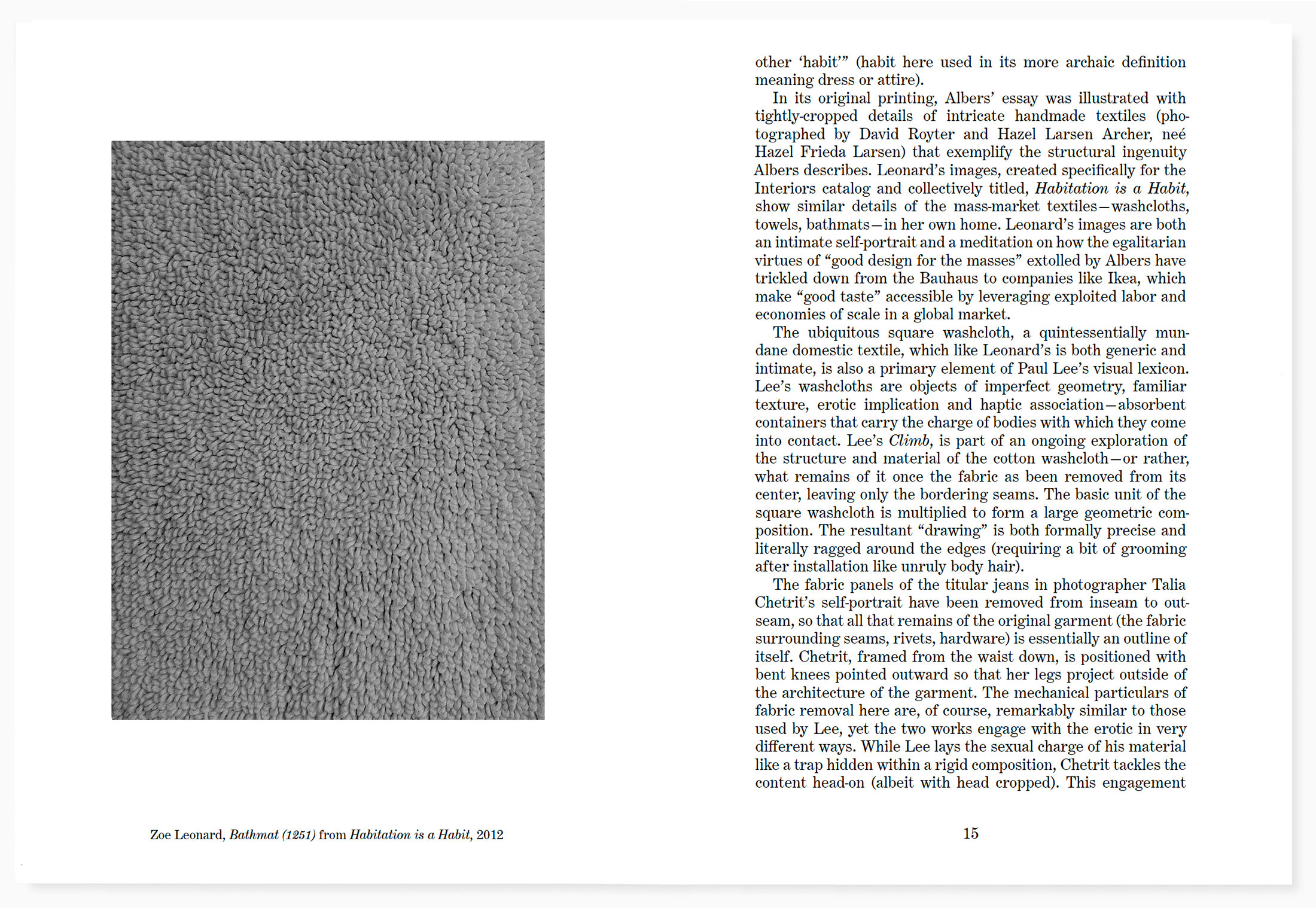
While I was working on this show, I came across a project by photographer Zoe Leonard printed alongside Anni Albers’ seminal essay The Pliable Plane: Textiles in Architecture in a catalog titled Interiors (produced in conjunction with an exhibition at the Hessel Museum of Art entitled, If You Lived Here, You’d be Home By Now, curated by Johanna Burton, Lynne Cooke and Josiah McElheny). Leonard’s project is a series of tightly-cropped iPhone photographs of domestic textiles in her home. Albers’ thesis in The Pliable Plane is that textiles, like architecture, originated with a need for shelter, but as civilization shifted from nomadic life to a predominantly sedentary existence, textiles moved to the interior, where they became domesticated—associated with decoration rather than structure. The Pliable Plane calls for a reengagement with the structural technology of textiles as a new way of thinking about architecture. “If we think of clothing as a secondary skin,” Albers writes, “we might enlarge on this thought and realize that the enclosure of walls in a way is a third covering, that our habitation is another "habit."” (habit here used in its more archaic definition meaning dress or attire).
In its original printing, Albers’ essay was illustrated with tightly-cropped details of intricate handmade textiles (photographed by David Royter and Hazel Larsen Archer, neé Hazel Frieda Larsen) that exemplify the structural ingenuity Albers describes. Leonard’s images, collectively titled, Habitation is a Habit, show similar details of the mass-market textiles—washcloths, towels, bathmats—in her own home. Leonard’s images are both an intimate self-portrait and a meditation on how the egalitarian virtues of “good design for the masses” extolled by Albers have trickled down from the Bauhaus to companies like Ikea, which make “good taste” accessible by leveraging exploited labor and economies of scale in a global market.
The ubiquitous square washcloth, a quintessentially mundane domestic textile, which like Leonard’s is both generic and intimate, is also a primary element of Paul Lee’s visual lexicon. Lee’s washcloths are objects of imperfect geometry, familiar texture, erotic implication and haptic association—absorbent containers that carry the charge of bodies with which they come into contact. Lee’s Climb, is part of an ongoing exploration of the structure and material of the cotton washcloth—or rather, what remains of it once the fabric as been removed from its center, leaving only the bordering seams. The basic unit of the square washcloth is multiplied to form a large geometric composition. The resultant “drawing” is both formally precise and literally ragged around the edges (requiring a bit of grooming after installation like unruly body hair).
The fabric panels of the titular jeans in photographer Talia Chetrit’s self-portrait have been removed from inseam to outseam, so that all that remains of the original garment (the fabric surrounding seams, rivets, hardware) is essentially an outline of itself. Chetrit, framed from the waist down, is positioned with bent knees pointed outward so that her legs project outside of the architecture of the garment. The mechanical particulars of fabric removal here are, of course, remarkably similar to those used by Lee, yet the two works engage with the erotic in very different ways. While Lee lays the sexual charge of his material like a trap hidden within a rigid composition, Chetrit tackles the content head-on (albeit with head cropped). This engagement with both sides of the often-conflicting strategies of photo-historical narratives of feminist self-portraiture (in this case Valie Export’s Action Pants: Genital Panic (1969), in particular) and the codes of contemporary fashion photography is at the core of Chetrit’s practice. That she is an active participant in the production of both modes is a biographical detail that matters only in as much as it helps explain how both sides of the dialectic seem so authentically self-possessed in her photographs.
In Untitled (The Drop 1), Adam Putnam is pictured in profile, naked with his forehead resting on his knees and his long body folded into the frame of the image. His wrists are bound with a rope, the trailing end of which, like the cable of the shutter release in his left hand, winds out of the photograph’s frame. In another image from the same group of work, the body is present only as a shadow over a masking tape spike on the studio floor, suggesting that the body is less a primary instrument in Putnam’s practice than just one among many materials on hand in the studio for sculptural arrangement.
The body is also a sculptural material in the work of German photographer Hans Breder. Breder’s Coralville Studio (1970) and Old Man’s Creek (1971), from the series of Body/Sculpture photographs taken in Iowa and Mexico between 1969-1973, depict intertwined assemblages of (invariably female) models and mirrors resulting in fractured bodies, doubled limbs and refracted appendages—fleshy antecedents to Lucas’ NUDs.
The surrealist photographer Hans Bellmer (not Breder) said, “the body is like a sentence that invites us to rearrange it, so that its real meaning becomes clear through a series of endless anagrams.” While each Body/Sculpture is something of an exquisite corpse, Breder’s ephemeral arrangements combine surrealist displacement with the groundedness of time-based earthworks like Robert Smithson’s Yucatan Mirror Displacements (1969) or “earth-body sculptures” like Ana Mendieta’s Silueta series (1973-1980). Mendieta was Breder’s student, partner and collaborator and, like Breder’s Body/Sculpture photographs (in which Mendieta frequently appears as model), Mendieta’s Silueta series (the actions of which were often filmed or photographed by Breder) were made primarily in Iowa or in Mexico while the couple travelled together during the summer. Mendieta’s Tree of Life (1976) is one of many works made on the banks of the same tributary of the Iowa River where Breder shot Old Man’s Creek (1971).
The influence of both Breder and Mendieta permeates the work of photographer Heather Rasmussen. The disjointed bodies in Rasmussen’s images appear in many forms—self-portraits, vegetable surrogates, three-dimensional scans and mirrored refractions. In Untitled (lemons, stacked), a pair of cleaved and misshapen backyard lemons stand one atop the other against a white ground. A powdery mold eclipses the top lemon. As in many of Rasmussen’s still lifes, the fruit is a stand-in for a body captured in a gradual process of decline—a minimal vanitas. The photograph’s pristine composition belies the lemons’ natural decay.
Kishio Suga’s A State of Direction—a round log, oriented vertically, painted black and split lengthwise with two broad cedar shims—hangs above Lucas’ NUD 19. Suga was an integral member of the group of Japanese artists referred to as Mono-ha (translated more or less as “a school of things”) and his early installations often consisted of elaborately networked assemblages of raw material. Like the Arte Povera movement, with which it was concurrent though not directly connected, Mono-ha explored the sculptural possibilities of natural and industrial material amidst the political unrest of the late 1960s. His Activation performances (1974 to 1981), focused on the interaction of the body and found objects. Throughout his career, Suga has described his practice as a process of unlocking a material’s desire to change and adapt. Like many of his more recent works, A State of Direction possesses a sense of levity while still reflecting Mono-ha’s fundamental interest in activating the latent properties that exist within unprocessed material.
In a 2012 text, “Muse: Ranch Hands and Farm Animals,” published in Art in America, Donald Moffett writes about the taciturn ranch hands he knew as a child in the hill country of central Texas. The domestic animals in Moffett’s story are angora goats and the neoprimitive style is the practical esthetic of the ranch hands’ improvised tools—“a cedar shim whittled with a pocketknife” or “a cedar fencepost hacked and shaped with a hatchet.” The tension in Moffett’s text lies in the interplay of this utilitarian esthetic and the erotics of the bodies that introduced it to him—the “impossible contrast between the dark of their exposed hands and the zinc white of their hidden skin.” The body (erotic, politic, electric) is a constant presence in Moffett’s work, a practice that spans from his early activism and graphic design as a founding member of Gran Fury to his more recent sculptural works.
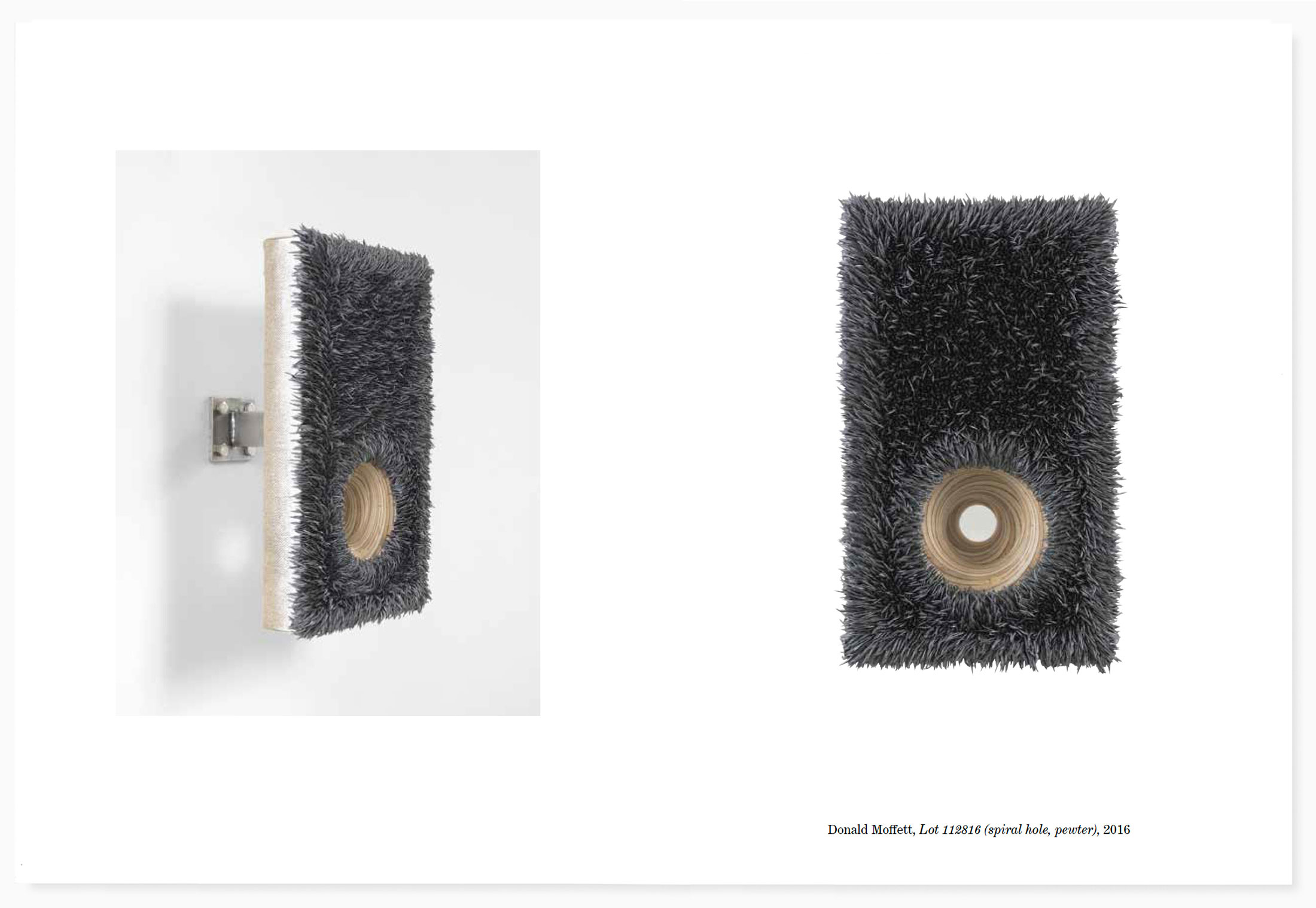
Moffet’s Lot Paintings are not paintings—they are sculptures composed of meticulously extruded bristles of oil paint that form a fur-like surface on a canvas substrate. Beneath the fur, there are holes. Lot 112816 (spiral hole, pewter) is a small canvas that stands several inches off of the wall on a steel support. A single beveled hole through the plywood backing exposes a vertiginous spiral of cross-grain at eye level, with gray oil bristles bending slightly inward around its circumference. Moffett has made hundreds of such holes—a sunshine hole, a cadmium hole, an entrance hole, an exit hole, a comfort hole, a magnetic hole, etc.—each suggestive of an anatomical orifice or a hirsute glory hole.
Tom Burr’s Shades of Green is an expansive installation of found window shades on a plywood plinth that covers much of the floor of the exhibition’s main room, pushing against the specific constraints of the gallery walls. The shades (pliable planes), varied in age and dimension, were salvaged from Burr’s family home in Norfolk, Connecticut. In his text, Some Elements of Some Styles (published in Artforum in September, 2010), Burr recounts the process of sculptural reclamation through which he extracted an array of materials—shutters, doors, windows—from the house to be “tangled with and pondered over, adapted and adopted, noticed and neglected, chosen or ignored.” As the homonymous title implies, the assemblage of shades, installed at various points in the life of the house, has faded to a spectrum of worn variations on the standard shade of hardware store window roller shade green.
Along with the architectural fragments, furniture and blankets, Burr often folds/drapes/pins his own clothes into his work—indices of the body as well as the building. Habitation is a habit. In the final sentence of Some Elements of Some Styles, Burr describes the process by which his clothes become material: “They have all been used, sat on, opened or closed, worn, and worn out; they’ve reached the limits of their domestic tenure, stretched to the breaking point, even, then retrieved, revived, and somehow reconstituted into the considered formation of some thing.”
In Kevin Beasley’s Untitled, a pair of the artist’s underwear lies flat against a black canvas, surrounded by resinous fingerprints. Beneath the underwear, three du-rags, stiffened with clear resin, project from the plane of the canvas to form a trio of empty hoods, tails extending stiffly towards the floor. Common narratives of contemporary black American culture are never far beneath the surface of Beasley’s work, but his objects are also intensely personal. The disused housedresses, paint-splattered studio clothes and floral kaftans that are among his primary sculptural materials are imbued with meaning from the bodies with which they have come into direct contact—often Beasley’s own or those of people close to him. The systems of personal histories accumulated in each article provide a starting point for a new work. As with Burr’s personally coded architectural fragments or the desires locked within Suga’s unrefined materials, the objects Beasley works with are generative. In a recent interview, Beasley explains, “your experience of an object involves taking in all that is accumulated within it.”
In the spring of 2006 I was working as a teaching assistant for artist Frances Stark while she was working on a show in Los Angeles to be titled Structures that Fit My Opening. A neatly shrink-wrapped stack of 500 invitation cards had come back from the printer with a typo—the title of the show, printed in magenta sans serif capitals, read, Sructures that Fit My Opening. Several calls were made and a corrected set was ordered for rush delivery. The misprinted stack remained unopened, tightly bound in a clear plastic skin.
This block of errata could serve as a prologue to this exhibition. Stark’s title’s intended double entendre evokes both an architecture and an orifice and the question of how one might or might not accommodate the other. The printed title’s typesetting failure is a reminder that any interaction between building and body, as unmediated as it may appear, is always subject to the influence of language. So too are the broader implications of Stark’s structure and her opening, both of which can be variously defined in relationship to the larger contexts of the art world, the body and the built environment. Ten years later that bundle of misprinted invitations, a three-dimensional block of two-dimensional cardstock, still sits unopened on my bookshelf.
Touchpiece installation images
book launch at KARMA bookstore
◼️